Premium fashion website design: what makes a site feel expensive, not just pretty
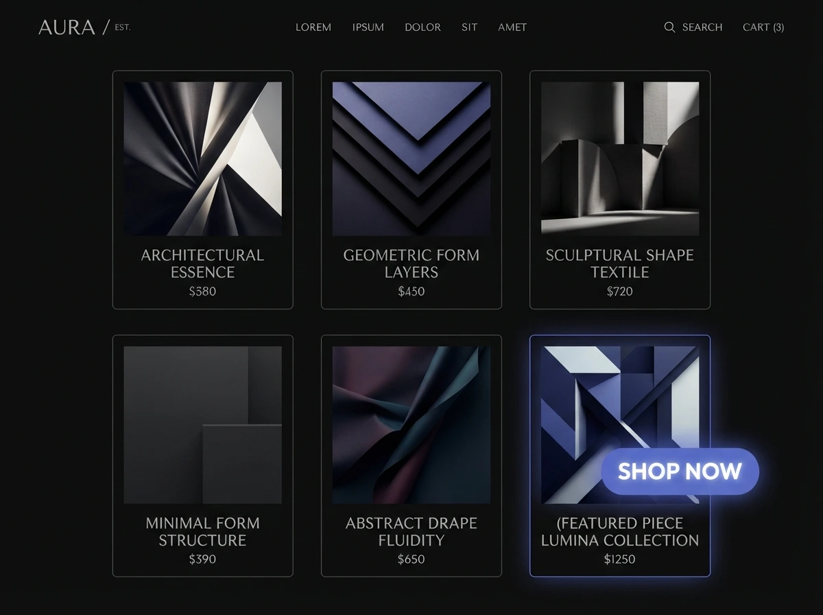
Premium fashion website design is often treated as a photography brief — hire a good shooter, drop the images into a template, done. But plenty of brands with gorgeous imagery still have sites that feel discount. The difference is in the craft around the pictures: how fast the page loads, how the type is set, how little the site shows off, and how much care went into the product page and checkout. Here is what actually reads as expensive.
So what actually makes it feel premium?
Confidence and restraint. A premium site tends to use fewer elements, more space, one or two typefaces, a tight colour palette, and slow, deliberate imagery. It loads fast, moves little, and never makes you hunt for the next step. "Pretty" is a moodboard; "premium" is a hundred small decisions that all point the same way — and most of them are invisible until they are done badly.
Isn't premium just a matter of nice photos?
Photography is necessary and not sufficient. If a beautiful hero image takes four seconds to appear, the first impression is "slow", not "luxury". Google's guidance is that Largest Contentful Paint — usually that hero image on a content-led page — should render within 2.5 seconds for most visits [1]. The fix is technical, not artistic: modern formats like WebP or AVIF, responsive image sizes, compression [2], and loading the hero with high priority rather than lazily [1]. A gorgeous photo served badly works against you.
Why does speed matter so much for a premium feel?
Because waiting feels cheap. Beyond the hero image, the server's first response — Time to First Byte — should be under about 0.8 seconds [4], and overall page experience is something Google's ranking systems actually use [5]. A premium brand that is slow reads as a brand that does not sweat details. Our piece on why a slow page loses the sale covers the commercial side of this.
What role do typography and whitespace play?
A large one, and it is cheap to get right. Set body text around 15–25px, line length to roughly 45–90 characters, and line spacing to about 120–145% of the font size [6]. Choose a real typeface with intent rather than leaving the browser default [6]. Give headings, images, and sections room to breathe. Tight, well-set type on a generous grid is one of the fastest ways to move a site from "template" to "considered".
How should product photography be handled technically?
- Serve modern formats. WebP or AVIF, with a fallback, cuts file size heavily for the same visual quality [2].
- Use responsive images. srcset and sizes (or the picture element) so a phone never downloads a 2000px file [2].
- Prioritise the first image, lazy-load the rest. The hero or first product shot loads eagerly; everything below the fold defers [1][3].
- Keep zoom and gallery images crisp. Premium buyers zoom in on fabric and stitching — plan a high-res source for that view.
What about motion and animation?
Less than you think. A premium site uses motion sparingly — a gentle fade as images enter, a smooth transition between pages — and never at the cost of speed or of the visitor's control. Heavy scroll-jacking, autoplaying video with sound, and elements that fly in from every direction read as a brand trying too hard. Restraint is the signal.
What does the product page need to feel considered?
Clear, large imagery with zoom; an honest, specific description; visible sizing help and a fit note; materials and care; delivery and returns stated plainly; and one obvious add-to-bag action. Our guide to the fashion features that actually convert goes through the product page in detail. The premium cue here is that every question a careful buyer has is answered before they have to ask.
Why does checkout so often undermine the premium feel?
Because it is usually an afterthought. Baymard's benchmark of 344 large retailers found 65% have a checkout rated "mediocre" or worse, only 2% "good", with the average site carrying 32 fixable issues — and around 70% of carts are abandoned, much of it down to checkout design [7]. A premium brand carries its restraint and clarity all the way through payment: few fields, guest checkout, no surprises, a calm confirmation. If the checkout feels like a different, cheaper website, the spell breaks. See the quiet leaks that ads can't fix.
Does it need to feel premium on a phone too?
Especially on a phone — that is where most of the traffic is, and responsive design means one considered layout that adapts, not a stripped-down mobile version [8]. The type still needs to be readable, the images still need to load fast, and the add-to-bag and checkout still need to be effortless one-handed. A brand that looks luxurious on a laptop and clumsy on a phone is a brand that only half-cares.
What makes a fashion site feel cheap or templated?
- Slow-loading hero imagery. Undermines the first impression instantly [1].
- Default fonts and cramped spacing. Reads as "we didn't design this" [6].
- Too many colours, badges, and pop-ups. Discount energy.
- A checkout that looks like a different site. Breaks the brand at the worst moment [7].
- Stock-looking layout with no point of view. Premium brands commit to a specific aesthetic.
Where should the budget go first?
Photography and a clear point of view come first — without those, nothing else can be premium. Then speed and image handling, then typography and spacing, then the product page and checkout. It is a smaller list than it looks, and most of it is craft rather than cost. If you want a fashion site built this way — or a read on whether your current one is close — send us the link, and our pricing shows where a build like this lands.
Sources & references
- web.dev — Optimize Largest Contentful Paint (LCP).
- web.dev — Learn Images (modern formats, responsive images, compression).
- web.dev — Browser-level image lazy loading (lazy-load below the fold, not the LCP image).
- web.dev — Time to First Byte (TTFB).
- Google Search Central — Understanding page experience in Google Search results.
- Practical Typography (Matthew Butterick) — Typography in ten minutes.
- Baymard Institute — Checkout usability research (benchmark of 344 retailers).
- MDN Web Docs — Responsive design.
Performance thresholds and best practices evolve; check the current guidance on web.dev and each source before treating a figure as fixed.
Want a fashion site that reads as expensive without acting slow?
Talk to us arrow_right_alt