Why is my online store not converting? The quiet leaks ads cannot fix
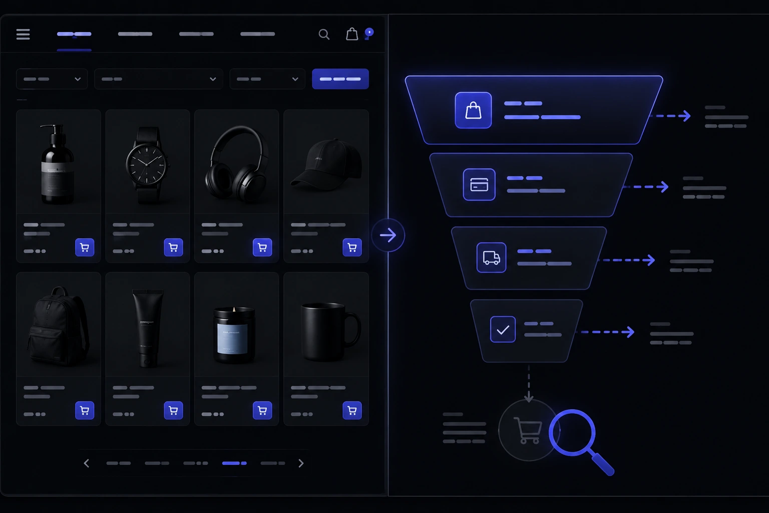
If you keep asking why is my online store not converting, stop staring at the ad dashboard first. Sessions going up while orders stay flat is usually a leak on the site: a checkout that fights people, a mobile layout that hides the buy button, a page that takes too long, or a store that does not look safe enough to give a card to. This is a conversion checklist for a US or Australian owner whose traffic is not turning into orders — not a lecture about buying a new theme.
Why is traffic going up while orders stay flat?
Because ads can only deliver people to the door. They cannot finish the purchase. Shopify's own conversion-rate writing is useful here: conversion is the share of visitors who complete the action you care about, and it moves when the path gets easier, not when the logo gets louder [12]. If paid traffic is cheaper this month and revenue is not, the store is wasting the click.
Harvard Business Review's old but still-true point is that customers punish broken basics more than they reward extra delight [15]. A spinning hero video is delight. Guest checkout, a visible shipping cost, and a page that loads on a phone are basics. Fix the basics before you blame the audience.
How do I tell if checkout friction is the real leak?
Look at add-to-cart versus completed orders. If people put things in the bag and then vanish, checkout is the leak. Baymard's long-running cart-abandonment research keeps landing in the same painful range: a large share of shoppers who start checkout never finish [1]. Their checkout-usability work keeps naming the same culprits: forced accounts, surprise costs, long forms, and weak mobile checkout [2].
- Forced account. If the first checkout screen is a login wall, you are asking a stranger to marry you before they pay. Guest checkout is not a courtesy. It is table stakes.
- Late surprises. Shipping, tax, or a handling fee that only appears on the last step is a trust break. Show the real total as early as you can.
- A form that feels like a loan application. Name, email, shipping, billing, and a password is too much for a $48 order. Cut fields until someone on your team complains it looks too short.
Hosted checkouts such as Stripe Checkout exist so you do not invent a payment page that leaks cards and confidence at the same time [8]. PayPal sits next to it for shoppers who refuse to type a card number. If your current cart needs a developer to change a label, that is already a conversion problem — e-commerce development is the work of making that path shorter, not prettier.
What does a painful mobile experience actually look like?
It looks like a desktop site squeezed onto a phone. Tiny tap targets. A sticky header that eats the Add to cart button. A size chart that only opens as a PDF. Pew's mobile research is a reminder that the phone is the whole shopfront for a lot of first visits [14]. Google indexes with a mobile-first lens, so a clumsy phone layout is also a discovery problem, not just a conversion one [7].
Nielsen Norman Group's e-commerce usability work keeps circling the same shopper jobs: find it, understand it, buy it without getting lost [5]. On a phone those jobs fail faster. If you sell apparel, the conversion details that actually matter — photography, sizing, and a cart that does not hide shipping — are closer to our fashion e-commerce features guide than to a new homepage animation.
- Thumb test. Buy a product one-handed on the train. If you need two thumbs and a zoom, shoppers will not finish.
- Form test. Type an address with autocomplete off. If the keyboard covers the next field, people abandon.
- Image test. Pinch-zoom a product photo. If the image pixelates or the page jumps, you just lost a sale that ads already paid for.
How much does page speed cost me in lost sales?
More than it feels like, because the people who leave never email you. Google's mobile speed research has been blunt for years: slow pages lose people before they ever see the product [3]. Core Web Vitals are the current public language for that same idea — largest contentful paint, interaction delay, layout shift [4]. Page experience is also part of how Google talks about ranking quality, so a sluggish store can hide from search and from buyers at the same time [13].
You do not need a perfect 100. You need a product page that paints the first useful image before the shopper decides the store is broken. Heavy hero videos, unoptimized galleries, and a pile of tracking scripts are the usual villains. If the site has not been touched since launch, start with why website maintenance matters — speed often dies from neglect, not from a bad first design.
Which trust signals do shoppers look for before they pay?
They look for proof you are a real business that will still exist after the charge hits. Nielsen Norman Group's work on trustworthy design keeps landing on the same cues: clear contact details, honest product information, and a site that does not look like a template scam [6]. A padlock in the address bar is expected. A returns policy written like a human is rarer, and it converts.
If you take cards, you are in PCI territory whether you like the acronym or not. The PCI Security Standards Council publishes the rules; most small brands stay out of the worst of it by using a hosted checkout that never sees raw card data [11]. US sellers should also read the FTC's guidance on selling on the internet so shipping promises and refund claims do not become a legal hobby [9]. Australian sellers have a parallel consumer-law overlay via the ACCC's online-shopping guidance [10]. Trust is not a badge pack. It is whether your words match what happens after the order.
- Reviews that look like people. A name, a date, and a specific comment beat five gold stars with no text.
- A real returns path. "Contact us" is not a policy. Say the window, who pays postage, and how long a refund takes.
- Contact that is findable. An email and a location beat a chatbot that cannot answer "where is my order."
Are my product pages selling, or just displaying photos?
A product page has one job: answer the objections that stop a buy. Size, material, shipping time, what is in the box, and what happens if it is wrong. Pretty photos without those answers are a lookbook. Nielsen Norman's e-commerce research keeps showing that shoppers abandon when they cannot complete those basic questions [5].
If the page is a leftover from a rushed launch, it may be one of the signs you need a website redesign — or it may just need better copy and a size chart. Do not rebuild the whole site to fix a missing measurement table. Rebuild when the information architecture itself is the leak: collections that dump 200 SKUs on one page, filters that do not work, or a search box that cannot find the product you know you sell.
Could shipping, returns, or surprise fees be killing the sale?
Yes, and it is one of the cheapest leaks to confirm. Baymard's abandonment research keeps listing unexpected costs as a top reason people leave a cart [1]. Shoppers will tolerate a shipping fee they saw on the product page. They will not tolerate a fee that appears after they typed a card number. The same is true for a restocking fee buried in a legal page.
US and Australian consumer rules both care about what you promised versus what you delivered [9] [10]. That is not only a legal issue. It is a conversion issue. If your ads say free shipping and the cart says otherwise, you trained people to distrust the next screen. Put the real shipping rule next to the price. Put the returns rule next to the size guide. Hide less.
How do I measure conversion without drowning in dashboards?
Pick four numbers and look at them every Friday for a month: sessions, add-to-cart rate, checkout-start rate, and completed orders. Shopify's conversion writing is enough of a definition to start with [12]. You do not need a full analytics rebuild to see whether the leak is the product page, the cart, or the last payment step.
- Sessions up, add-to-cart flat. The leak is merchandising, mobile layout, or speed. People never wanted the product enough, or they never found it.
- Add-to-cart up, checkout-start flat. The cart is ugly, slow, or hiding shipping. People put something in and then got scared.
- Checkout-start up, orders flat. The form, the account wall, or the payment methods are the problem. This is where Stripe or PayPal usually earn their keep [8].
Give it a real month, not a quiet Tuesday. Change one thing at a time. If you change the theme, the ads, and the shipping rule in the same week, you will not know what worked. A spreadsheet is enough. A new dashboard is not a strategy.
What should I fix first if I only have two weeks?
Fix the path, not the brand film. In two weeks you can usually: turn on guest checkout, show shipping before the last step, compress the heaviest images, make the buy button reachable on a phone, and write a returns policy a human can read. Those are the broken basics HBR was talking about [15]. They also line up with Baymard's checkout findings [2] and Google's speed research [3].
Use a small business website checklist so legal pages, contact, and HTTPS are not the embarrassing afterthought. If Shopify is the stack and the theme is fighting you, Shopify development is often faster than starting over. If you want a studio-shaped sense of what a proper store build costs after the leaks are named, our website pricing page is the honest starting band.
When is a redesign the answer versus a checkout tune-up?
Tune the checkout when the brand still looks like you and people can find products, but they die on the form. Redesign when the site itself is the objection: dated layout, broken mobile, pages that feel like 2016, or a catalog that cannot be browsed. Speed and Core Web Vitals still matter either way [4] [13].
A redesign will not save a store that surprises people with shipping, forces an account, or takes eight seconds to show a price. Do the two-week path first. If orders still do not move and the site feels embarrassing on a phone, then it is a rebuild conversation. Look at our recent work if you want to see the difference between a coat of paint and a store people can actually finish buying from.
Should I keep spending on ads while the store leaks?
Throttle them. Do not turn the brand off, but do not pour paid traffic into a checkout you already know is broken. Every click you buy is a more expensive way to confirm the same leak. Mobile speed research is especially unkind here: a slow landing page burns the click before the product story starts [3]. Pew's numbers on mobile use just make that more likely, not less [14].
Keep a small always-on campaign if you need data. Pause the big spend until guest checkout works, the total is honest, and a phone can complete an order in one sitting. Then turn the tap back. Ads are not the enemy. They are a multiplier. Multipliers make leaks louder.
When is the store itself the wrong channel?
Sometimes the leak is not the checkout. It is that the product still needs a marketplace aisle to get found. We already wrote the longer version in marketplace vs own store. The short version: if you have traffic and a broken path, fix the path. If you have no traffic and a perfect cart, you have a demand problem, not a conversion problem.
Many brands do both for a while. That is fine if the own-store catalog is the source of truth. It is not fine if you are blaming conversion for a store nobody can find, or blaming ads for a form nobody can finish. If you want a second pair of eyes on which leak you actually have, talk through the tradeoffs with us. We will tell you when a two-week checkout tune-up is enough, and when you are about to rebuild a store that was never the bottleneck.
Sources & references
- Cart abandonment rate — Baymard Institute.
- Checkout usability research — Baymard Institute.
- Mobile page speed and industry benchmarks — Think with Google.
- Web Vitals — web.dev.
- E-commerce usability — Nielsen Norman Group.
- The components of trustworthy design — Nielsen Norman Group.
- Mobile-first indexing — Google Search Central.
- Stripe Checkout.
- Selling on the internet — US Federal Trade Commission.
- Online shopping — Australian Competition and Consumer Commission.
- PCI Security Standards Council.
- Conversion rate optimization — Shopify.
- Understanding page experience in Google Search results — Google Search Central.
- Mobile fact sheet — Pew Research Center.
- Stop trying to delight your customers — Harvard Business Review.
Figures, product names, and pricing may change after publication; verify with the source before relying on them.
Want help finding the leak?
Talk to us arrow_right_alt