Mobile friendly website importance: ranking, sales, and first impressions
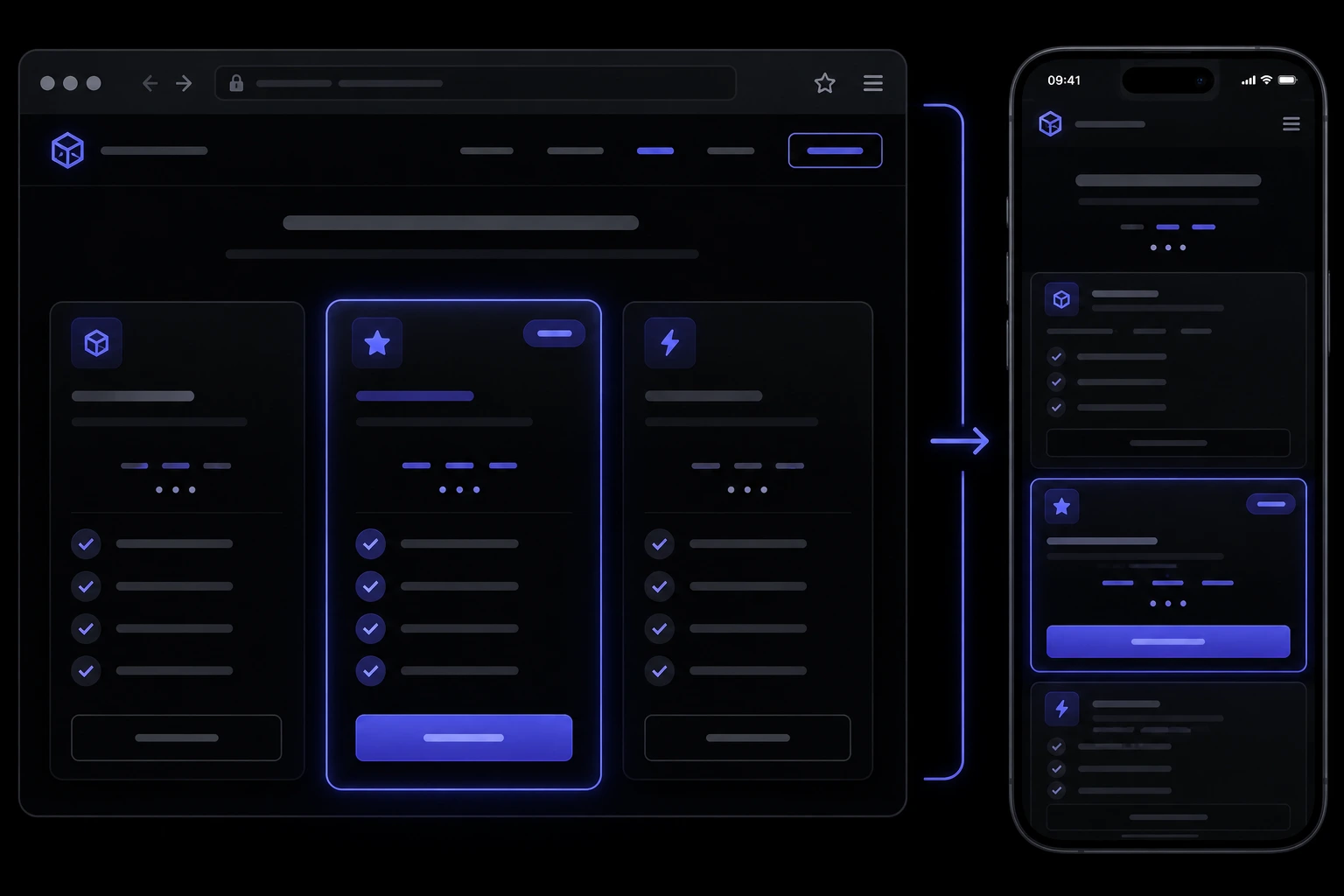
If you still design for a 27-inch monitor and hope phones will cope, you are betting against how people actually find you. Mobile friendly website importance is not a trend line in a pitch deck. It is whether the first visit — usually on a phone, in a queue or a car park — looks like a real business or like a leftover desktop screenshot. Search now ranks the phone version of your pages. Shoppers bounce when buttons are tiny, text is pinched, or checkout takes six extra taps. This is the owner version: what “mobile-friendly” actually means, how it ties to ranking and conversion, and what to ask before you pay someone to “just make it responsive.”
What does a mobile-friendly website actually mean?
It means the same site reflows to a narrow screen without sideways scrolling, unreadably small type, or buttons you cannot hit with a thumb. Google’s long-standing advice is still responsive design: one URL, one set of HTML, a layout that adapts with CSS — not a separate m-dot site you have to keep in sync [13]. The W3C’s accessibility guidelines cover the same practical stuff owners feel: text that wraps, targets large enough to tap, content that does not require a mouse hover to exist [12].
- Readable without pinch-zoom. Body copy should sit at a comfortable size. If customers have to spread two fingers just to read your hours, the layout failed.
- Tappable, not just clickable. Nav, forms, and the main call-to-action need space. Fat-finger errors on a booking or checkout field are how you lose a sale you already paid to attract [9].
- The important stuff is above the thumb-scroll, not only above a desktop fold. Phone, address, Book, Shop, hours. If those wait until paragraph four, the phone visitor already left.
How much of my traffic is even coming from phones?
For most small businesses, “most of it” is the honest default until your own analytics prove otherwise. Public traffic trackers have shown mobile overtaking desktop for years on the open web [6]. Global digital reports keep repeating the same shape: people live on smartphones, and a large share of web time happens there [7]. In the US, smartphone ownership among adults is the default, not a youth trend [11].
Your mix depends on the work. A B2B quote form filled at a desk can still be majority desktop. A cafe, clinic, retailer, or trades business that gets found on Maps is usually phone-first. Open your analytics, set last 90 days, split device. If more than half the sessions are mobile and the conversion rate on mobile is half of desktop, you do not have a “traffic problem.” You have a layout problem wearing a marketing costume.
Does Google still rank a desktop-only site?
It can crawl it. It will not treat it as the version that matters. Google Search has used mobile-first indexing for years: the mobile version of the page is what gets indexed and used for ranking [1]. If the phone view is a shrunk desktop, missing content, or blocked resources, you are showing Google a worse page than the one you admire on your laptop.
Page experience sits on top of that. Core Web Vitals — loading, interactivity, visual stability — are part of how Search talks about a usable page, and they are measured on real devices, not your office fibre [2] [3] [14]. A desktop-only layout that “looks premium” can still fail those checks on a mid-range Android. Ranking is not the only cost. Even if you scrape by in results, the click lands on a site that feels broken, and that visit teaches Google nothing good.
How does a bad phone layout actually kill conversions?
People do not write you an email that says “your tap targets were 8 pixels.” They close the tab. Usability research on phones keeps landing on the same failures: tiny controls, hover-only menus, forms that zoom and hide the keyboard, and checkout that asks for too much too soon [9]. On stores, cart abandonment is already high even on a decent desktop flow; mobile checkout usability is one of the well-documented leak points [8].
- The primary button is below a wall of desktop-width content. On a phone that wall is six extra scrolls. The visitor came to book, buy, or call. Hide that, and they assume you are closed.
- The form was designed with a mouse. Tiny dropdowns, no input types for email or tel, and a “submit” that sits under the iOS keyboard. That is not picky. That is a missed enquiry.
- Speed feels like the site is down. Think with Google’s mobile speed work is the one owners actually remember: as load time stretches, the chance someone leaves jumps hard in the first few seconds [5]. web.dev’s speed guidance is the same idea without the marketing slide [4].
What are Core Web Vitals, and why do they hit phones hardest?
They are Google’s field metrics for “did this page feel usable”: Largest Contentful Paint (did the main thing show up), Interaction to Next Paint (did taps feel instant), and Cumulative Layout Shift (did the page jump while you tried to tap) [3] [14]. Lab tests on a developer laptop lie. Field data from phones on real networks is what Search and CrUX care about.
Phones lose first because they have less CPU, flakier radios, and smaller viewports that make layout shift obvious. The HTTP Archive’s performance chapters keep showing a gap between desktop and mobile experience on the live web — heavier pages, slower LCP — even as tools get better [10]. You do not need to memorise the thresholds. You need Search Console’s Core Web Vitals report and a walk-through of the live URL on a real phone, not only Chrome’s device toolbar.
Is a separate mobile site better than a responsive one?
Almost never, for a small business. A second m.example.com or a “lite” template that hides half the content is how you get ranking mismatches and stale hours on one URL but not the other. Google’s own mobile-first documentation is explicit that the mobile version should have the same primary content, and responsive is the recommended pattern [1] [13]. One site, one CMS, one set of edits.
Responsive is not a theme checkbox. A theme can claim it and still serve a hamburger that covers the CTA, a 2,400-pixel hero that eats the battery, or a table that only works at 1,200 pixels wide. That is when you are looking at a rebuild versus a patch — more on that below, and it is one of the clearer signs you need a website redesign than “we are bored of the colour.”
How do I know my current site is failing on phones?
Do the unscientific test first: open the site on your own phone on cellular, not office Wi-Fi. Time how long until you could tap the thing a stranger would tap. Then do it with one hand. Then ask someone who did not build the site to find your hours and send an enquiry. If they hesitate, customers hesitate.
- Analytics split by device. Bounce, conversion, and form-complete on mobile versus desktop. A pretty desktop conversion rate with a dead mobile one is the smoking gun.
- Search Console. Mobile-friendly leftovers, page-experience / Core Web Vitals, and “crawled as Googlebot Smartphone.” If Google’s phone crawler sees a thin page, that is the page that ranks [1] [2].
- Real-device filmstrip. PageSpeed Insights or a WebPageTest run on a mid-range phone profile. The HTTP Archive data is the industry backdrop; your URL is the thing you can fix [10].
Put those findings next to a small business website checklist at launch. Phone layout, tap targets, and a working form on a small screen belong on that list the same way SSL does — not as a phase two.
What should I fix first if the desktop version looks fine?
Start with the path money takes. Homepage hero and primary CTA, then the contact or book flow, then product or service pages that already get traffic. Do not begin with a new illustration on the About page. Speed work that actually moves LCP — compressing the hero, deferring junk scripts, not loading three sliders — usually pays faster than a visual restyle [4] [5] [10].
- Navigation a thumb can use. If the only way to reach Contact is a hover mega-menu, phones never see it. A simple stacked menu is not “less premium.” It is usable.
- Type and spacing. Increase body size, line height, and the gap around buttons. NN/g’s mobile work is decades of people failing tasks on small screens for exactly this class of issue [9].
- Forms. Correct input types, fewer fields, visible labels, a submit button that stays on screen. For stores, shorten checkout; Baymard’s research on abandonment is the reason not to invent extra steps [8].
If the theme cannot reflow a three-column grid without overlapping, you are out of CSS tweaks and into website development that treats the phone layout as a first-class design, not a leftover.
Do I need an app, or is a good phone website enough?
For almost every small business, a good website on a phone is enough. Apps win when you need push notifications, offline tools, or a logged-in product people open daily. They lose when you have to convince someone to install something they will use twice a year. Nielsen Norman Group have been blunt for years that a usable mobile website covers most tasks; a native app is an extra product, not a substitute for a broken browser site [9].
If what you actually wanted was “book on a phone without a phone call,” that is a website with a booking flow, not an App Store listing. Same for a catalog. Build the phone site first. Add an app only when you can name a job the browser cannot do.
How is this different for a store versus a brochure site?
A brochure site fails when nobody can call, find the address, or send the form. A store fails when they cannot complete payment. Product grids that look handsome at 1,400 pixels often become a horizontal swipe puzzle on a phone. Filters designed for a mouse, sticky add-to-cart bars that cover the last field, and guest checkout buried behind an account wall are the usual leaks [8]. Fashion and catalog brands feel this immediately: lookbook energy on desktop, tap-and-pinch on mobile — which is why fashion e-commerce features that convert are so often just “can I shop this on a phone without rage.”
If you are scoping e-commerce development, ask to see the cart and checkout on a real device in the proposal, not only the homepage mock. Stripe or PayPal (or your platform’s checkout) should be reachable in a short, thumb-friendly path. A pretty grid that cannot sell on a phone is a brochure with prices.
What should I ask a developer before they start?
Ask them to design the phone layout first, then expand. Not as a slogan — as deliverables. You want: breakpoint mockups, a real-device QA pass, Core Web Vitals targets, and a statement that hover-only UI is not allowed. Google’s mobile-first and page-experience docs are fair contract language: the phone page is the page [1] [2] [13].
- Which phones do you test on? A current iPhone and a two-year-old Android on cellular. Chrome’s device mode is a sketch, not a test.
- What is the LCP budget for the template? If they cannot talk about image weight and third-party scripts, the hero video will win and your vitals will lose [3] [4] [10].
- Where does the primary action sit on a 390-pixel screen? If the answer is “in the footer after the testimonials,” rewrite the brief.
Ongoing website maintenance services should include a periodic phone pass, not only plugin updates. Layouts rot when someone adds a popup, a chat widget, or a new announcement bar that eats the first screen on mobile and nobody checks.
When is a rebuild cheaper than patching a desktop layout?
When the grid is tables and absolute positioning. When the CMS theme is a decade of stacked plugins. When every “mobile fix” creates a desktop regression. At that point you are paying for archaeology. A focused rebuild that starts from the phone path — one column, honest type, a form that works — is often fewer hours than fighting a layout that was never meant to wrap [13].
Rebuild if mobile conversion is clearly worse, Search Console is red on phone vitals, and a designer cannot show you a one-column version of the current templates without inventing a new site. Patch if the structure is already stacked and you mainly need type, tap targets, image weight, and a form. Either way, the job is the same: the phone visitor is the real visitor. If you want a straight read on which side of that line you are on, send the live URL and a screenshot of your device split in analytics — we will tell you if you need CSS, a template pass, or a project.
Sources & references
- Mobile-first indexing — Google Search Central.
- Understanding page experience in Google Search results — Google Search Central.
- Web Vitals — web.dev.
- Why does speed matter? — web.dev.
- Mobile page speed: new industry benchmarks — Think with Google.
- Desktop vs Mobile vs Tablet Market Share Worldwide — Statcounter Global Stats.
- Digital 2025: Global Overview Report — DataReportal.
- Cart Abandonment Rate Statistics — Baymard Institute.
- Mobile Usability Update — Nielsen Norman Group.
- Performance — HTTP Archive Web Almanac 2024.
- Mobile Fact Sheet — Pew Research Center.
- Web Content Accessibility Guidelines (WCAG) 2.2 — W3C.
- Responsive Web Design — Google Search Central.
- Understanding Core Web Vitals and Google Search results — Google Search Central.
Traffic shares, vitals thresholds, and vendor docs change; verify the linked source before you treat a statistic or a ranking factor as current for your site.
Want a site that actually works on a phone?
Talk to us arrow_right_alt